WORK
How do you look established when you’re brand new?
There’s a strange thing about launching a new brand. You know how much work has gone into the product. You know the ambition behind it. You know where you want it to go.
But your customer knows none of that. They see the brand first.
That was the challenge with Misogi Health, a new red-light therapy business built around recovery, performance and wellbeing.
The founders were entering a market where people already have a pretty good eye for quality. Their audience spends time around premium gyms, good hotels, great restaurants, fashion and established lifestyle brands. They know what polished looks like, even if they can’t always explain why.
So Misogi needed to arrive looking like it belonged. Not like a startup finding its feet, but as a brand people could trust.
Looking the part matters
The founders brought me in to take responsibility for the visual identity and turn what they had into something launch-ready. The job wasn’t simply to make it look nicer. It was to remove doubt.
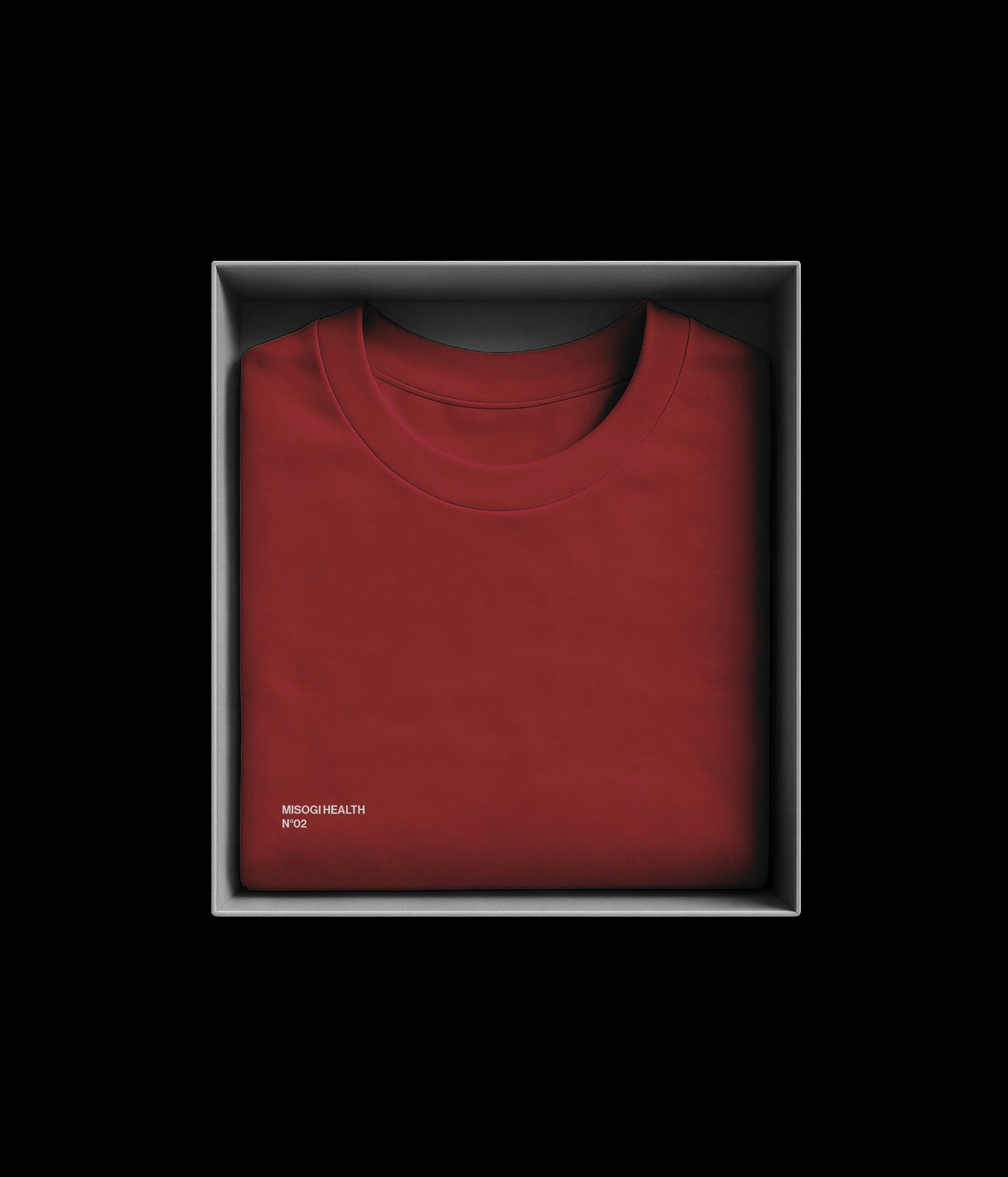
When you’re new, you don’t have years of reputation to lean on. The packaging, identity and details have to do more of the work. They need to reassure people that the product has been thought through, that the people behind it care, and that the brand belongs in the world they already aspire to.
That meant finding the balance between premium and accessible.
Too clinical and it starts to feel cold. Too sporty and it becomes aggressive. Too luxurious and you risk making it feel out of reach.
Misogi needed warmth, confidence and credibility.
Building the brand around the idea
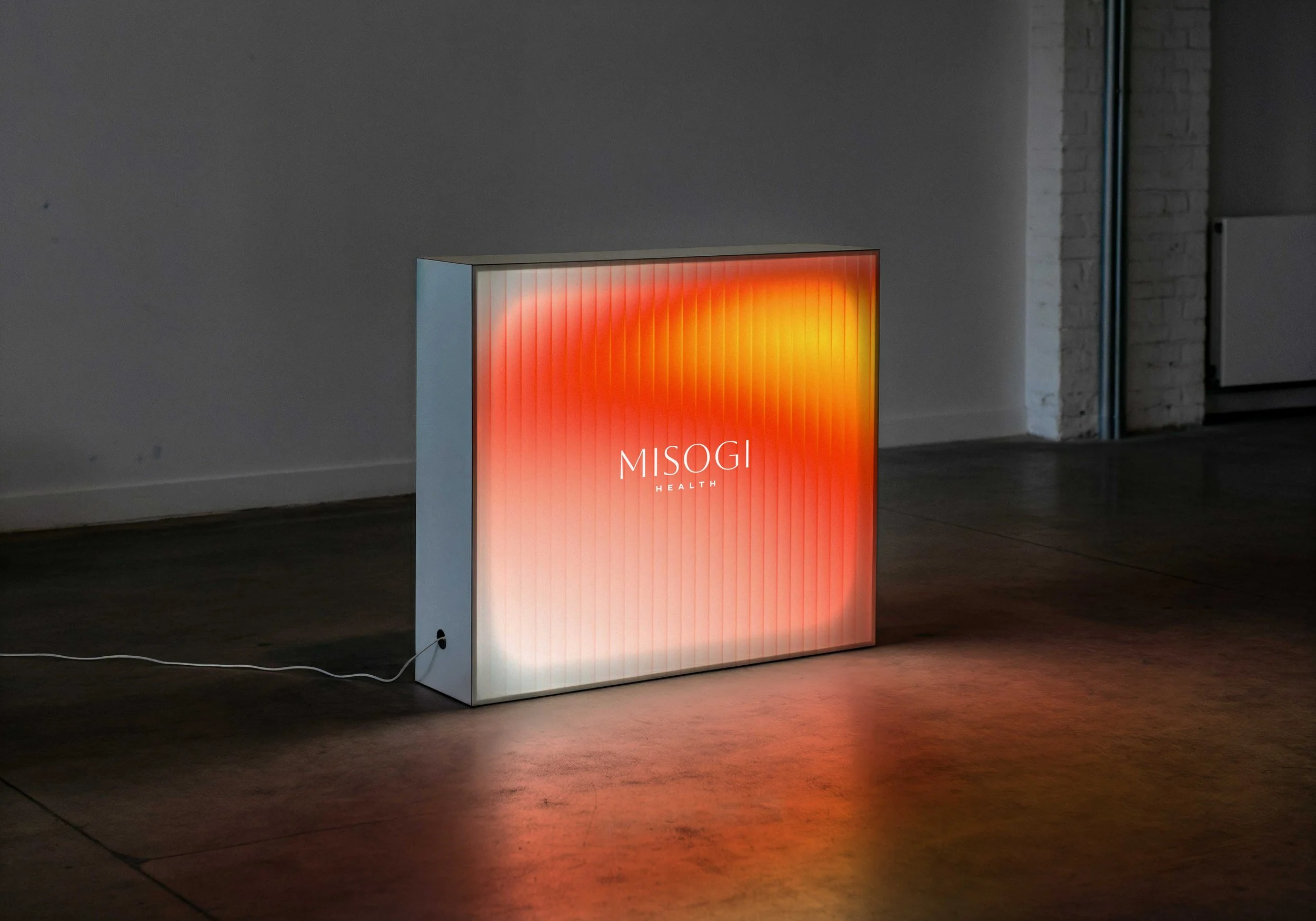
The name Misogi comes from the Japanese ritual of purification through water. That gave the brand an interesting place to start. Instead of water, this was about red and near-infrared light. Recovery through light rather than immersion. That idea helped shape the visual language.
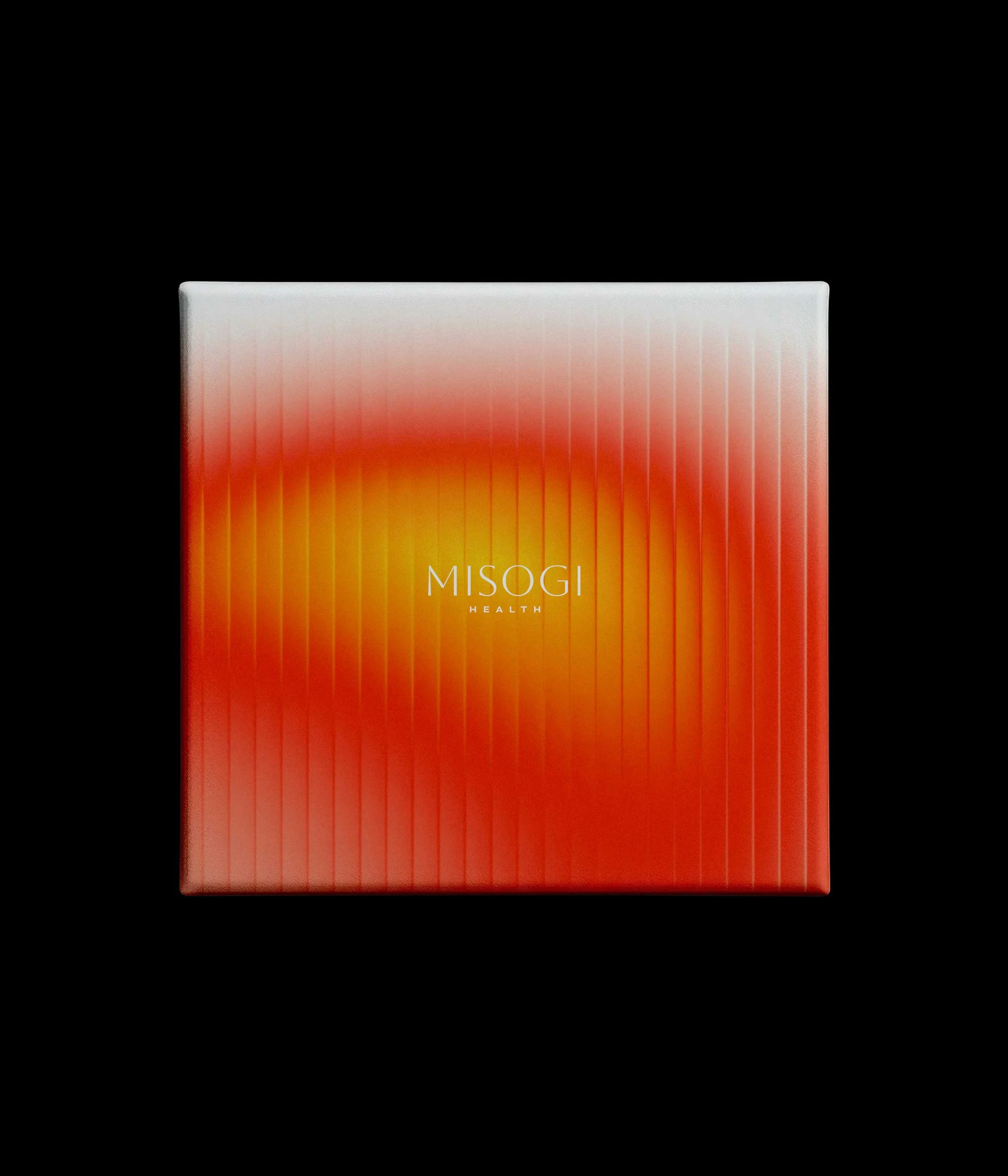
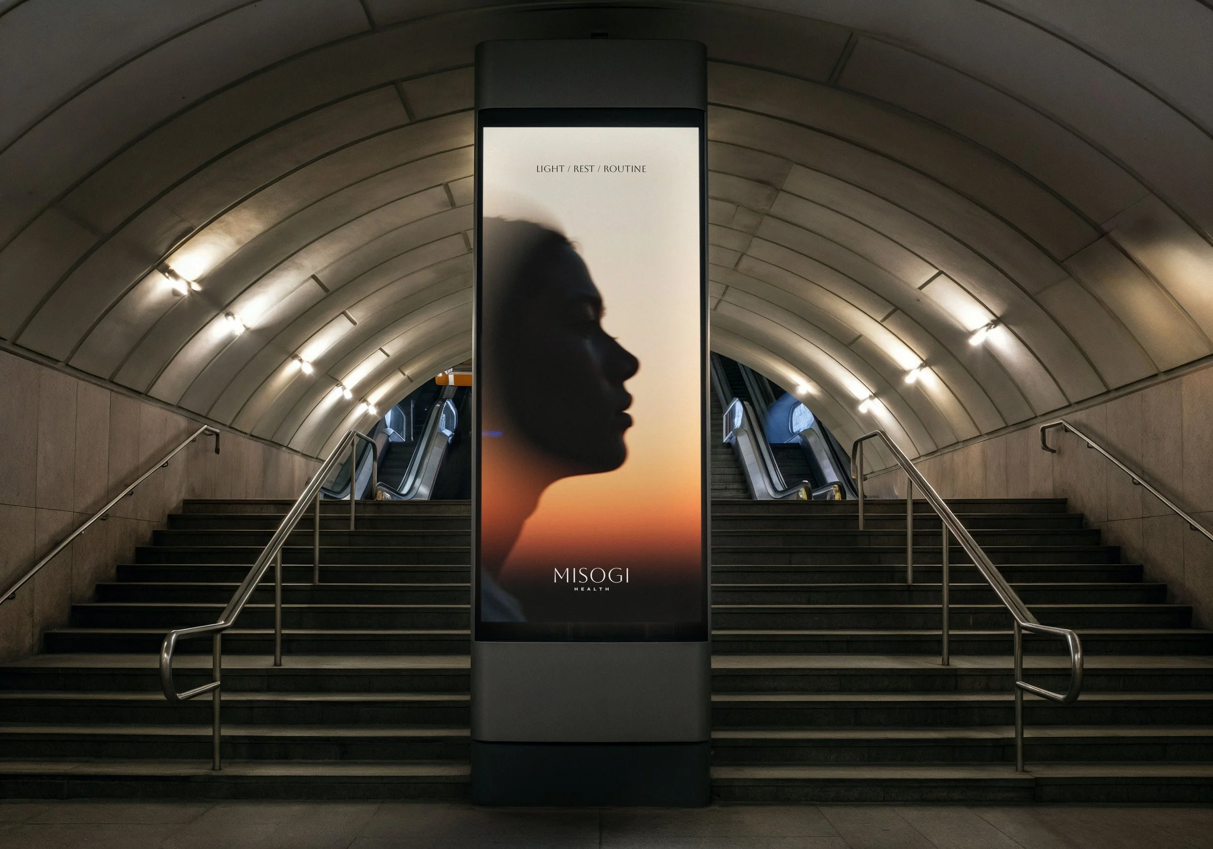
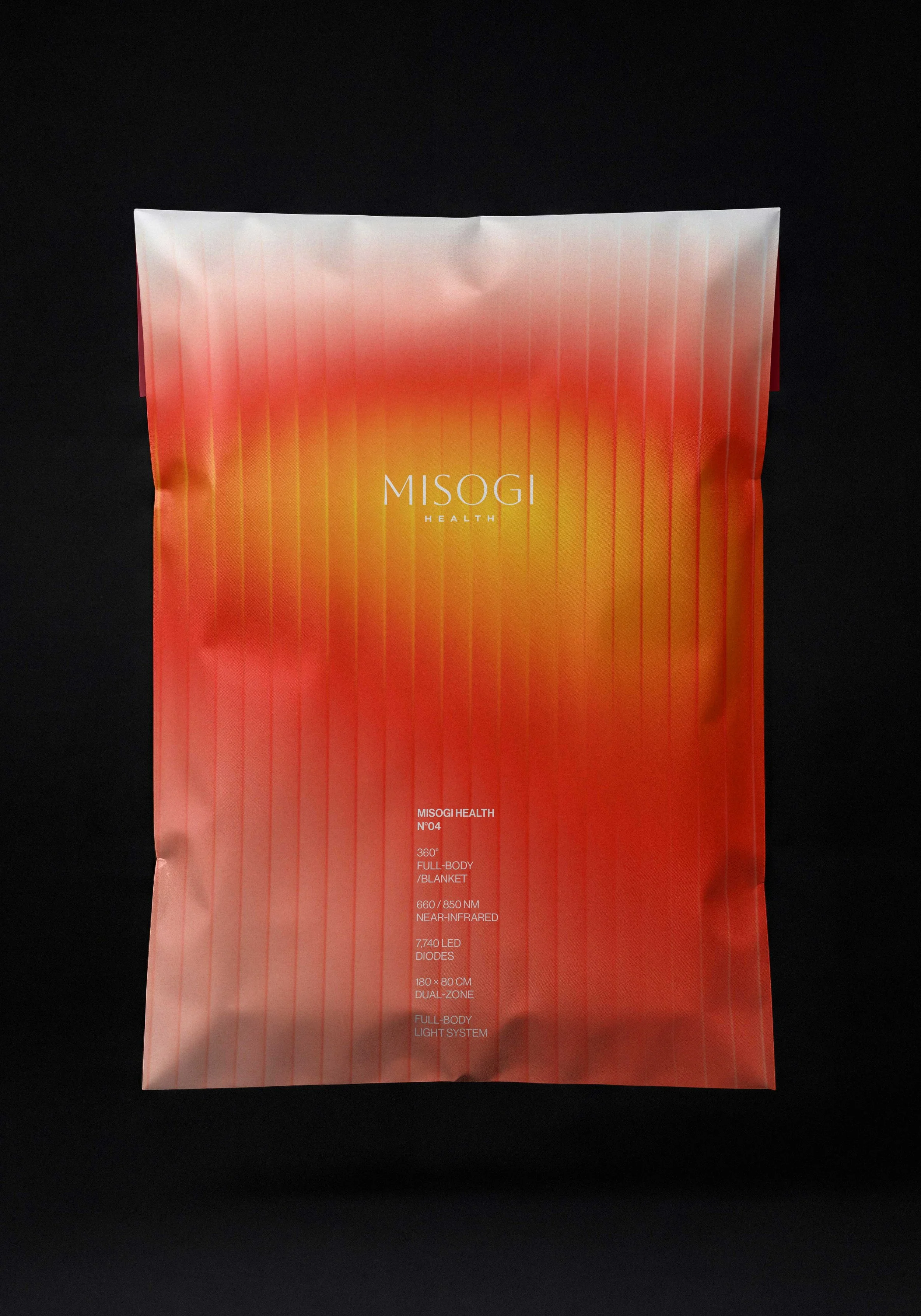
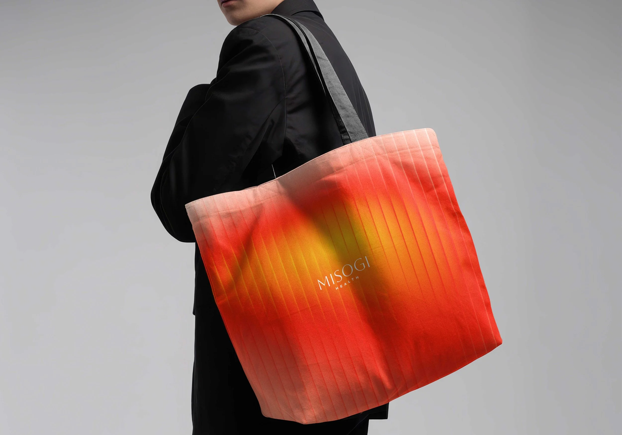
Warm colours. Energy. Restoration. A sense of something powerful, but calming at the same time. From there, the identity became a complete system: a new logo, colour palette, typography, packaging and product manuals.
The point was consistency.
Everything had to feel like it came from the same place. So when the products launched, the business already looked like a brand rather than a collection of separate decisions.
Ready to go
That’s probably the bit I like most about projects like this. Good branding gives a business confidence.
The founders could move forward with packaging, products and customer materials knowing the creative decisions had already been made properly. They had something coherent to build on rather than having to reinvent the brand every time they needed a new asset.
Misogi has now launched, started making sales and is looking at expanding the range. There’s more to come too, from photography and copy to the wider tone of voice.
But the first job was simpler. Make a new brand look like it belongs in the room. Because when you’re asking people to trust something new, looking the part isn’t superficial.
It’s part of the proof.
“Thad helped us take Misogi from something that still felt quite early-stage into a brand we felt confident launching.
He quickly understood the audience we were trying to reach and gave the whole identity a level of polish, consistency and credibility that we simply didn’t have before.
What was especially useful was being able to hand over a big part of the creative responsibility and trust his judgement. He took care of the identity, packaging, typography and product materials, and gave us a clear system we could actually use.
The end result felt considered, premium and much more established. It gave us confidence to go to market and start building from a much stronger foundation.”
Jeremy Coll - Founder Misogi Health