WORK
The brand that had to argue against its own audience
Astra Protocol did compliance for crypto.
Read that again. Compliance is the thing crypto was built to escape. Regulation is the villain in every whitepaper. And here was a platform whose entire product was importing financial standards from a hundred and fifty countries and three hundred sanctions watchlists into an industry that had spent a decade avoiding exactly that.
They were pre-token. They needed institutions. And they needed crypto natives to trust them at the same time.
Those two wanted opposite decisions, and the obvious move is to pick one. Go institutional and you land somewhere between a bank's compliance deck and a consultancy's: safe, cold, invisible. Go crypto and you're one of a hundred tokens with the same gradients and the same floating cubes.
Most briefs like that get answered by picking the safer one and hoping nobody notices.
The mistake is going too far towards either audience. Too crypto and you look immature, and the institutions you need won't take the meeting, because everything about you says this isn't serious. Too corporate and the people who actually use the product think you've sold out, and they're the ones who tell everyone else.
So we had to look like we belonged in both rooms without belonging to either. Capable, but contemporary. That's not a mood. It's a series of very specific decisions where a small overcorrection costs you one of the two audiences entirely.
The typeface was the one I thought about most. It had to feel made now, and characterful enough to belong to someone, and it had to still look right in five years. The instinct is to pick the safe grotesque that would make an institutional investor comfortable, except that same typeface tells the crypto side you're another consultancy pretending to be a startup. The other instinct is the expressive crypto display face, which makes the community feel seen and makes a compliance officer put the deck down.
The brief I gave myself was: it has to enamour you with both the formal world and the rebellious one. Because that's what crypto actually is, and nobody in the category was admitting it.
Then colour, then composition, then how much space a page was allowed to leave empty. The same test every time. Does this still feel serious, and does it still feel alive.
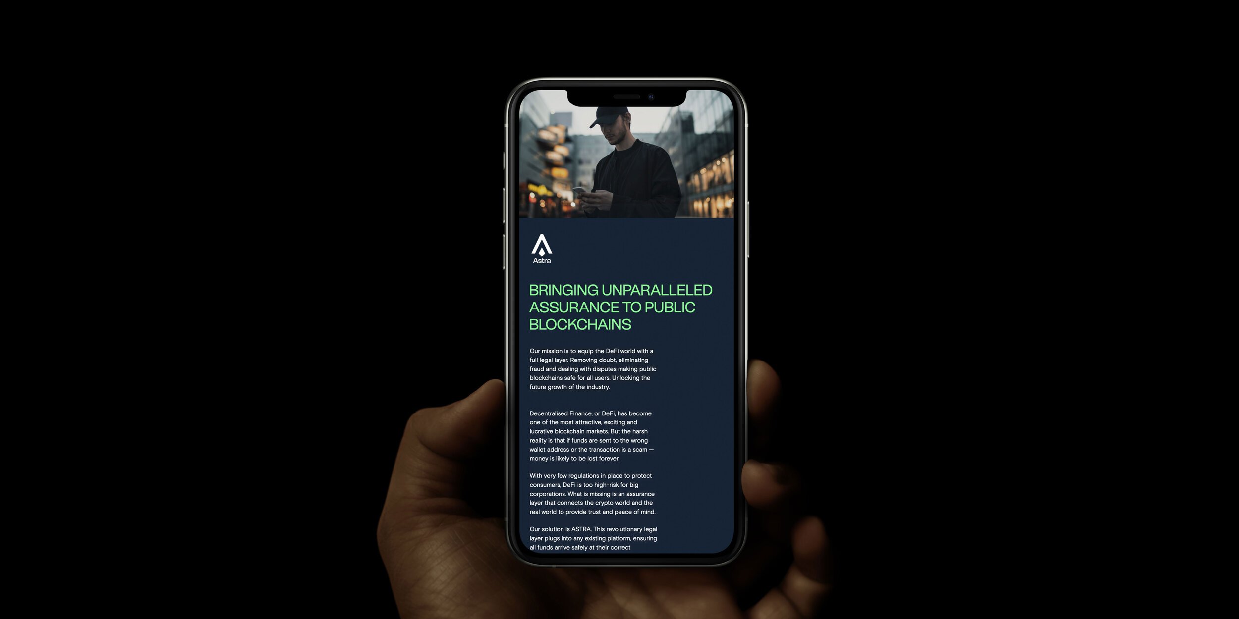
I was the executive creative director on it. Identity, the pitch decks, the website, and the Telegram community, which matters more than it sounds when your audience judges you by how you behave in a channel you don't charge for.
Damien, the founder, didn't push back on any of it. He trusted my judgement and let me get on with it, which is more unusual than it sounds and is the whole reason the work holds together. The decisions were intentional and nobody in the room was arguing for a safe version, so nothing got negotiated into compromise. That's the case for being one person with a point of view rather than a committee with a process.
Then the evidence arrived in two waves. MarketAcross, DailyCoin and Hackernoon picked it up, which told us the crypto side trusted it. Then IBM, Binance, KPMG, DLA Piper, Cardano and Chainlink.
Those names are the punchline. Not because big logos are impressive, but because a crypto platform signing those logos means the brand did the one job it existed to do. It made something unfamiliar feel safe enough to sign.
The part I take into the work I do now: the answer was never in crypto, and it wasn't in compliance either. Every competitor was looking sideways at each other. The useful move was to name the contradiction out loud, admit it was the most interesting thing about the business, and then refuse to resolve it in the obvious direction.
A brand isn't the thing you design to remove an awkward tension. It's the thing you design to hold one.